Our new project was to create an animated ad banner advertisement to promote an event, a service, a product, or a business. In our ad banner we had to use an image and text. We used the programs Adobe Photoshop and Adobe Flash Professional to create the ad. I chose to do my advertisement on condo rentals in Perdido Key, Florida because summer is coming up and people take vacations, especially to the beach. Perdido Key, Florida is not a place many people know about so that’s why I chose to do my banner on this. The audience for my ad is for everyone but mostly for adults. This is a good place for people to go and relax. I chose the ad banner tutorial called simple sunset image effect. The exact size of my banner is 400 x 300. I used a picture that was taken of Perdido Key Beach in Florida. Here is the original photo I used. I used text on my banner to say what my ad is about and where the picture is. To create my banner, I used the Align panel tool so my picture would fit “the stage.” I used the convert to symbol tool to make my picture a movie clip. I used the create a new layer tool to make the text layer. I had to keep that layer above my image so the text would show up on my picture. I used the adjust color tool to make the brightness of my image -50, I changed my contrast to 60, my saturation is 10, and my Hue is 10. I also used the create classic tween tool when I was almost done with my banner. I added a drop shadow to my text on my banner and rotated and skewed the text. I had to use these tools on my ad banner because I did not have enough tools used in the tutorial. The ad above is my finished piece. The way I added my banner to my blog is I first had to upload my Flash animation to a website. I did this by going to google.com, then signing in to my account. Next, I created a site with a blank template and gave it a name. Then I clicked on "more actions" and "manage site". I then clicked on "attachments" and then clicked on the "upload" button. I had to upload the .swf file and use the URL for the code our teacher gave us. I then click on the HTML tab on my blog post and copy the code into the box. I had to change the URL part of the code to the code of my website and change the width and height of the code to the size of my banner. The banner should then appear to my blog. The entire ad took me a class and a half to make. This concludes my blog.
Friday, March 23, 2012
Wednesday, December 7, 2011
 |
| Before |
 |
| After |
For our project in computer class, we are to lookup on Google, Photoshop Photo Editing Tutorials. Once we found a tutorial that we wanted to use on a picture, we began working with it on Adobe Photoshop. The Photoshop tutorial I chose to work with is Instagram. I found this tutorial by typing in Google, "Adobe Photoshop Tutorials." I then clicked on this website link. I chose this because I liked the way Instagram made a picture look. The picture I used was a picture I took of the beach when the sun was setting. The beach is at St. George Island in Florida. I started editing my photo in Photoshop by double clicking on the background layer to make it into an actual layer and changing the name to layer 0. I then created a new layer by clicking layer, new fill layer, solid color, and clicking ok. I then changed the Red to 247, Green to 217, and Blue to 173. I left the Opacity at 100% and I changed my blending option to "multiply." The next thing I did was click back on layer 0 and clicked on Image, then Adjustments, and clicked on Curves. I changed the green curve output to 37 and the blue output to 133. Next I went back to Image, Adjustments, and this time I clicked on Levels. I changed the middle level on input to 1.36. In the far right box in input I changed that to 236 and hit ok. Next I went back to Image, Adjustments, Brightness/ Contrast and made the brightness to 25 and the contrast to 60. If the "use legacy" box is checked, uncheck it and hit ok. I then went back to Image, Adjustments, and Curves and went to green and this time I changed the input to 20. Next, I went back to Image, Adjustments, Brightness/ Contrast and changed the brightness to -6 and the contrast to 33. The next thing I did was I went to Image, Adjustments, and Curves to change the blue output to 25. The last step I did was I flattened the image.
Tuesday, November 29, 2011
Merrick Construction and Roofing Wind Storm Advertisement
In computer class, we are creating advertisements. We are using the same company we created logos for. Our advertisement needs to be for an event held by the company. To create the advertisement, we used the program Adobe Photoshop. I then downloaded a paintbrush from a website to use for my background. I had to resize the brush to make it fit the page and the size I wanted it. I chose a color I wanted the background to be and applied the paintbrush to the advertisement. I added the text to my page by using the horizontal and vertical text tool. I used two different fonts on my advertisements and I added a drop shadow to the text on the top of the advertisement. Next I added a picture of a damaged roof on a home to go along with my advertisement. The picture needs to be in the public domain. I edited the picture by changing the brightness, shadows, and vibrance. I also rotated the picture to the right by using the transform button. I added a border to the advertisement by double clicking on the background layer and pressing layer style. On the side bar, I chose the stroke button and chose the size I wanted for my advertisement. The last thing I did to the advertisement was I added the logo I created for the company. I used the transform and scale to make the logo the size I wanted it to be. I had to use the magic wand tool to get rid of the white background of the logo I originally had and blended the logo background to the background of the advertisement.
I created this advertisement because my dad’s company, Merrick Construction and Roofing, works on roofs. His company was busy after the wind storm Louisville, KY faced in 2008. I created this advertisement by coming up with the idea of the company giving inspections and 10 yards of singles for free to any customer who called by a certain date. The shingles are placed on the roofs by the company so the people who not have to install it themselves. The target audience for my advertisement is anyone who faced roof damage during the wind storm in 2008.

Monday, November 14, 2011
Merrick Construction and Roofing Logo
In computer class, we designed logos for companies who do not have a logo yet. We first sketched up designs for a company’s logo. Then once we had a good idea of what we wanted to design we used the program Adobe Photoshop on the computer to design the logo. I used a variety of tools on Photoshop to create the logo like the paint brush tool, line tool, custom shape tool, and horizontal type tool.
The company I made a logo for is my dad’s construction and roofing company. The logo communicates its purpose by having a ladder and a roof. The ladder is what my dad uses to get on roofs that he works on. Also, it has the initials MC which stands for Merrick Construction. The colors I chose to use on the logo are a dark red, light gray and dark gray, and black. I chose the color dark red because it looks masculine, which only men work for my dad and also dark red means wrath. I used black because the meaning for this color is power and also this color helps the dark red stand out more.
When I used the brush tool, it was to create the MC of the logo. I used the pen that is attached to the computer to use the brush tool. It takes steady hands to use the brush tool with the computer pen. I made the letters bigger than the ladder and the roof because I wanted to add emphasis. The most important part of the logo is the MC, the company. I used the line tool to create the ladder. I had to change the weight several times to get the line the way I wanted it to look. I also had to create the lines in a diagonal. I used the custom shape tool to create the roof. I found a triangle shape that I could use as the roof and I rotated the shape to the angle I wanted it. Lastly, I used the horizontal type tool to type the company’s name at the bottom of the logo. To create a shadow on the logo, I used the blending options on each layer to add the shadow behind the image.

Thursday, October 27, 2011
If I Looked Like A Celebrity
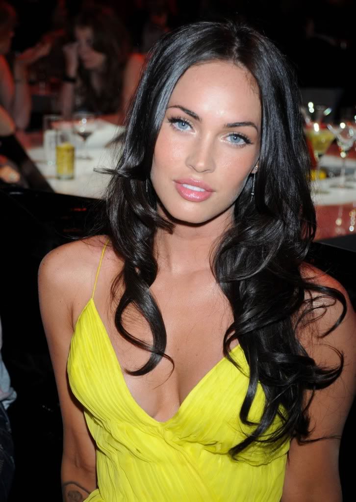
In computer class, we were assigned to make the perfect body image. Our class used the program Photoshop to do all the putting together of the two pictures. The way our class did this is we each found a celebrity picture with the person's face and body facing straight ahead. The celebrity I wanted to look like was Megan Fox. Then our teacher took a picture of each student by their self with no makeup on and no fixed hair dos. After our picture was taken, we then started to touch up our self portrait. I touched up my picture by adding face make up, eye shadow, mascara, and eye liner. I also changed my eye color. Once I thought my picture looked the way I wanted it to, I used the lasso tool to just cut out my face and paste it on the celebrity picture. After I pasted my face on the celebrity's body, I had to make my face fit over her face on her body. Then I changed my skin color to match the celebrity's skin color. Lastly, I used the eraser tool and burn tool to touch it up and make the picture look realistic.
I feel really good about the overall transformation of the picture. I did really well with touching up my self portrait picture and putting my face on the celebrity's body. I made my skin color match her skin color and I formatted my face perfectly where her face used to be. Doing this project has changed the way I view pictures in magazines. I never knew how easy it was to cut out a person’s face and put it on someone else’s body to make it look like it is the actual person. I now question the pictures I see in magazines or on the internet and wonder, is this really that celebrity or someone else? The pictures we see in magazines or on the internet make people today feel self conscious about them. People want to be like the celebrities they see in pictures, so they lose wait to be skinny like the celebrity is or get plastic surgery to look like a celebrity. Our society today thinks we should like skinny, tan, Botox, Barbie dolls. The way our society thinks they should like is becoming a major problem. We are all made the way God wanted us to be. If we all looked the same, we would live in a perfect world. It is better to be yourself and be considered an individual.
I think the two best things I did on my picture are adding makeup to my face and blending my face into the celebrities. My makeup looks realistic and my skin color matches up with the celebrities. The things I did worst on were fitting my face perfectly where her face is. My face looks awkward because of her large forehead and a mark she has on her face makes my face look bad.
Before Picture

After Picture

Tuesday, October 11, 2011
My Daily Life in Photographs
In my computer graphics class we have been working with the program Photoshop. This program is difficult but fun at the same time. Our class was assigned groups and each group had to demo a certain tool in Photoshop. The tools we learned ranged from using selection tools to retouching photos. Learning all these new tools was difficult to me. Especially since I could not even figure out where half of the tools were or how to drag a photo onto another photo. For those of you who are experts at Photoshop, I give you thumbs up! When we started using Photoshop, the class was given the assignment to do a collage of pictures that shows a day in the life of a mercy student. Each person did their own collage and had to use five different tools in Photoshop on the pictures.
On my collage, I used the tools color balance, crop, spot healing tool, levels, and red eye. When I used the color balance, I chose the sky part of the pictures and changed the colors of the sky. When I used the tool crop, I cropped out parts of the picture I did not need to make more space for other pictures on my collage. The spot healing tool was for spots on the faces of people in the pictures. I eliminated those spots in the picture to make the person look presentable. When I used the levels tool, I used it also on the sky part of my pictures to change the darkness, lightness, and midtones of the picture. This changes the pictures color drastically. Lastly, I used the red eye tool on a few people in my pictures to make the people look less devilish.

On my collage, I used the tools color balance, crop, spot healing tool, levels, and red eye. When I used the color balance, I chose the sky part of the pictures and changed the colors of the sky. When I used the tool crop, I cropped out parts of the picture I did not need to make more space for other pictures on my collage. The spot healing tool was for spots on the faces of people in the pictures. I eliminated those spots in the picture to make the person look presentable. When I used the levels tool, I used it also on the sky part of my pictures to change the darkness, lightness, and midtones of the picture. This changes the pictures color drastically. Lastly, I used the red eye tool on a few people in my pictures to make the people look less devilish.

Sunday, September 25, 2011
Photography Elements in New York City
Our class has now moved into Photography elements. I am not the greatest photo taker so my photography skills are not so wonderful as some people. Most of you all may not know what photography elements are. Below, I have taken three picutres to show three elements to give you an idea on some of the photography elements.
 The first element is balance. This was taken in New York when half of my senior class and myself went to New York for two days. This is the picture of one of the new Twin Towers. This picture symbolizes balance because it has balance of the buildings on both sides of the picture.

 This picture symbolizes Framing. This is a picture of the New York Stock Exchange Building in New York City. This picture symbolizes framing because it is highlighting the main part of the picture which here is the American flag.


This is a picture that symbolizes Lines. This is a picture of Ellis Island and this was also on our senior New York trip. There are several different lines used here in this picture, especially on the building.

Subscribe to:
Posts (Atom)